The Legal Stuff

All images on this blog are copyright of A. Hampton and the Hey Mister H! Blog unless otherwise stated.

Monday, August 27, 2012

The Menagerie Amasses

It's the beginning of the week again (sort of), so in case yours is off to a bad start (or not) here are a couple of animal paintings to brighten your day.
First up is a monkey.  Usually I'd be more specific with the monkey's species name, but for the life of me I can't remember what this one is.  I worked from a photograph on this, so I know it is an actual species... Anyway, I painted it because I like monkeys.  Add to that the fact that for some reason this particularly bizarre little monkey was chewing on a piece of volcanic glass, and it was practically screaming (to me at least) to be painted. Some day I'll find just the right place in my house to hang this one. Since he's apparently hungry enough to eat volcanic glass, maybe over the kitchen table would be appropriate. Definitely not the bathroom, though. I don't think anyone would want to have a wide-eyed monkey staring at them as they step out of the shower. Well, maybe some people...weirdos...
This next little guy is a scarlet ibis.  I tried a different painting technique than I usually use on this.  As opposed to most paintings where I start with a solid white canvas, on this one I painted the whole canvas black first (for other examples of this method, run an Google image search for "velvet Elvis").  The desired effect (which was achieved) was to give the ibis a stronger sense of chiaroscuro, or light and dark and, in doing so, gives the subject a stronger sense of three-dimensionality. A similar effect could have been achieved by using the "standard " method and painting tones and shades of the bird's natural bright scarlet by adding white, black, or even small amounts of green paint to it while mixing. That method, however, can easily make vibrant red into muddy pinks and dull reds if not done correctly.
There you have it, Sund...er...Monday's post. Hopefully I'll be able to get back onto some kind of normal posting schedule this week.  Don't forget: Comments are always greatly appreciated. Let me know what you think about my art and/or blog.
Stay creative,
AH!

Thursday, August 23, 2012

Mid-Week #10: An Epic Battle... of Decoupage!

So for this mid-week post I decided to share some of my art of a different medium.  These are a pair of decoupage pictures. They aren't traditional decoupage, since I didn't use any complete pictures instead opting to use the pictures of textures and colors to form new pictures.  These started as an assignment for a mixed-media class in college. I had never done any decoupage before this, but took to it like a duck takes to water...or like a fish takes to swimming...or like a bull takes to trampling through the streets of Pamplona, Spain...anyway, you get the idea. I began with the wolf while in class, and enjoyed that so much that I came home and started the lion.  I threw in individual images and detail close-ups of the faces to give a better idea of what sort of texture images form the animals and background.


Well, as you probably noticed, I also made a few cosmetic changes to the blog this week. The biggest of these being the addition of a new header.  As time goes by, I'm going to try to update the logo using the styles of some of the artists that inspire me. After going through many different variations, I settled (with a little help from a couple of friends) on the design below.  The design is a tribute to the late, great Jack Kirby who co-created such characters as Captain America, the Fantastic Four, the Hulk, and the X-Men, among others. His artistic style is among my all-time favorites. The background of the caption bubble is my attempt at replicating one of his most famous techniques known as the Kirby krackle (one of the few times I'm okay with a word being intentionally misspelled).
I can only hope that my art will some day be even one-millionth of the inspiration to others that Mr. Kirby's art is to me and artists worldwide. Until Sunday...
Stay creative,
AH!

Sunday, August 19, 2012

Woohoo! Fall's Just Around the Corner!

So, after a crazy week, I've come to the painful realization that I simply won't be able to post every Sunday and Wednesday. That being said, I vow to make every effort to miss as few of those days as possible.  I have grown to enjoy this whole blogging process quite a lot since I started and miss it when I don't get a chance to post. Anyway, without further ado, here is the Sunday post.

Since I'm posting paintings for a few weeks, I thought some simple landscapes would be a good starting point. Most of the paintings I'll post in the coming weeks were painted during my time in college, but hopefully as time progresses, I'll produce even more to share with you.
These are both landscapes painted from photographs of Arkansas.  From very early childhood my family has taken camping vacations in various places throughout the southern United States.  Arkansas, specifically the Albert Pike Recreational Area in the Ouachita National Forest, has always been a family favorite spot. The period at the beginning of fall, when the leaves are just starting to turn is a nature-loving artist's dream come true.  Between these two paintings, I'm a bit partial to the first one. It features one of the more shallow spots in the Little Missouri River. Artistically, I like the way that the background trees going up the side of the mountain turned out. It was my first attempt at aerial or atmospheric perspective, where the contrast between the landscape features decreases as the distance from the observer increases. That's all just a kind of fancy way of saying that the stuff that's far away is less clear than the stuff that's close up. I opted for less detail and more of an abstract take for this one, almost going to the point of being impressionistic.
 This next one is of one of the many winding mountain roads that lead to and through the Ouachita National Forest.  I went even more abstract with this one, which gives it less depth. I also used more strong fall colors that really illicit great childhood memories for me. While the painting above gives a morning or early in the day feeling, this one has more of an afternoon or early evening feel. Were I to paint it again I would probably include a bit more tree shadow on the road, but given the more abstract overall feel of it, I guess they aren't that missed.
Well, there you go. There will of course be more paintings next week, so stay tuned for that. Wednesday, I'll try to get my regular post up, but barring any unforeseen obstacles I will be debuting the new blog page header. I hope you're enjoying the painting posts so far. Since I haven't mentioned it in a while, feel free to post any comments or suggestions in the section below, or send them to me by email. Hope you all have a terrific week! See you (figuratively speaking...er...typing) Wednesday.
Stay creative,
AH!

Wednesday, August 15, 2012

My Apologies for the Slight Delay

Due to a pretty crazy day today, and likely much of the same tomorrow, the usual Wednesday post will probably go up either late tomorrow or sometime Friday evening... or maybe Saturday... or maybe I'll count this mid-week post a loss. Hmmm... Whichever it ends up being, thanks in advance for your patience.
-AH!

Sunday, August 12, 2012

Here Come the Paintings!

Wow! Those posts last week were the best EVER, right?!...
Wait...don't tell me the space aliens got to them again! Greedy aliens. It's so frustrating when they do that. I guess I'll post them again this week so you all can see them too.
So here are a few paintings I was commissioned to do by a friend at church. They aren't really indicative of my normal style, but they are the only three that I've had a chance to get good pictures of. She basically gave me only 3 criteria to fulfill. First, she wanted a specific color set to go with her furniture and other decor. Second, she had a series of words to be included (specifically the nine aspects of the fruit of the Spirit as described in Paul's Letter to the Galatians chapter 5 verses 22-23 in the Christian Bible). And finally, I was to include my own interpretations of nine eastern Asian inspired images that she had chosen. I don't by any means profess to be an expert when it comes to the creation of objective abstract art. That being established, I finally finished the triptych and she liked it, so I suppose I accomplished my mission. Here they are, both individually and in what I consider to be their optimal wall arrangement.
As a side note, I feel like it's worth pointing out that regardless of your personal beliefs, if we all took on even some of these nine traits it would be beneficial to mankind as a whole. Our world has quite enough negativity, but could easily stand to be a little more patient, gentle, kind, loving, etc,.
There you have them, hopefully safe from extraterrestrial interference this time.  As usual (well usually, as usual) check back Wednesday to see what's else I've got in store for your viewing enjoyment.  Until then, let's all make this oft-too-crazy world we live in a happier place any way we can. And of course...
Stay creative,
AH!

Thursday, August 2, 2012

Mid-Week #9: Wired Wednesday Lucky 7

Welcome to what may or may not be the final Wired Wednesday for a while! Since I'm so late posting and sharing masks again, I might as well go with Theatrical Thursday.  If only science had been able to grasp the elusive secret to faster than light travel, I might even have been able to post it Wednesday night on Thursday morning...Moving on...

First up is a mask that I'm hesitant to call complete.  It is loosely based on Balinese masks of the lion-like king of spirits, Barong, the leader of the forces of good.  I really like the extremely expressive masks of both Barong and his evil nemesis Rangda (a mask of whom will also be constructed at some point).  They are recognizable by their exaggerated eyes and mouths.  I will likely add more of a frame to this eventually and give it a nice mane and beard, also made of wire, of course.
 Next is a more Egyptian inspired mask. In case you've missed the context clues throughout my blog, I enjoy the mythologies of various cultures throughout the world.  This, as I said, is a mask of any of the variety of hawk or falcon headed gods of ancient Egypt.  Like the Barong mask above, I will probably add more to this one in the future, but for now I'm happy with it hanging on my wall as it is. I really like the way the feathers turned out in this one. While ideally I could have a three-dimensional image you could rotate to see all the different angles, you at least can get a better view of the feathers from the profile shot I also included.
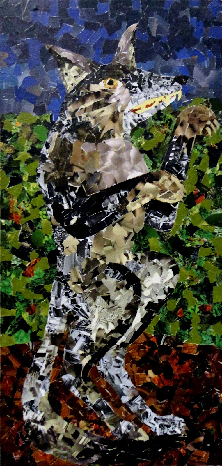
Finally is one that has a much less mythological inspiration.  It's a goat.  I suppose one could argue that there are several instances of goats in various world mythologies, but this is your basic run-of-the-mill goat. I think goats get a bad reputation from their (admittedly creepy) horizontal slit pupils. In fact, they share that genetic trait with deer, cattle, most horses, and many sheep species all of which benefit with greater peripheral depth perception. The primary difference being that goats have lighter colored irises, so the strange shape stands out more.  You may be thinking "None of that has to do with art or wire," but remember that any artistic reproduction you make with the desire to accurately depict reality must begin with close observation of the aforementioned reality.  Plus, creepy factor aside, their eyes look kind of cool.
Thus ends (maybe) the saga that has been Wired Wednesday. Changes lie ahead for the Hey Mr. H! blog. Starting Sunday, the first of the week posts will now periodically be featuring some of my paintings, so be sure to check back in for that. And don't forget, if you like what you see on this or any other post, share it with a friend. Blogger supports a variety of social media (twitter, Facebook, etc.,) In any case, I hope you have a wonder-filled second half of the week. Until next time.
Stay creative,
AH!

Sunday, July 29, 2012

Tooth and Nail

I guess that given these drawings, maybe "Teeth and Nails" would be more appropriate, but it just didn't have the same ring to it.
First up is a character that has little by way of explanation, but what there is I'll tell you.  This is Pearlie.  Pearlie is one of those drawings that just sort of popped out of the depths of my subconscious. I find teeth to be interesting and at times disturbing.  Just think of all of the famous characters who would look vastly different without them. Bugs Bunny, Jaws, Count Dracula, and Goofy are just a few (admittedly disparate) examples. The shape of each of those characters' teeth is a huge part of the viewers identification of who they are.  Pearlie is no different.  Given his rather massive mouth it is apparent that he is a talker. His huge white rounded rectangular teeth betray his non-threatening disposition. The dark eyes could be a little ambiguous, so I also gave him a whimsical hairstyle to add to the overall goofy impression he gives.
This next one requires the least amount of description of nearly anything I've posted so far. It's simply a skull.  Since, barring any invertebrates who have taken to reading my blog, all of us have skulls it is one of the most recognized shapes I can think of. The symbolism associated with them is pretty clear too. Unfortunately danger, death, poisons, and general warnings are all commonly associated with skulls (frequently accompanied by crossed bones). Because of those connections, most people have a bit of a mental block against noticing the finer details of skulls. Who knows why? Maybe it's a human instinct thing. Whatever the reason, that simple fact makes a skull a great practice for observing and drawing details. It's arguably one of the most unfamiliar familiar things you can draw. Give it a try sometime.
Finally is a critter that I drew purely for the fun of it.  Have you ever thought about the term "fish fingers" that is given to the formed pressed pieces of fish served in many school cafeterias?  This is the answer to that very question. This is also another of my drawings was directly inspired by a fifth grader's suggestion. Since, as far as I know, a fish of this type has never been observed in the wild, I had free reign to give it whatever details I wanted. As you can see I decided it should have a beak. There's not really a logical reason for that decision, I just liked the way it looked. I thought having a big toe for its side fin was a nice addition as well.
Well, there you have it. I should point out that this week's title not only hinted at the drawings you'd see, but also at how hard I'll have to work to make sure I have something to post next Sunday. I think I may begin showing some of the paintings I've done, or maybe make some more drawings... who really knows what all can transpire in a week. Check back to see, and be sure to tune in midweek for the next installment of Wired Wednesday.
Stay creative,
AH!