The Legal Stuff

All images on this blog are copyright of A. Hampton and the Hey Mister H! Blog unless otherwise stated.

Sunday, June 30, 2013

Summer: A Time for Bizarre Animalia

     Okay, so in the interests of full disclosure, there isn't really a time of the year that isn't a time for bizarre (and frequently fictional) animalia.  So here three such creatures.
     This first one should be recognizable to those familiar with classical mythology, or even heraldry.  It's a gryphon (griffin, if you prefer that spelling). They are usually represented as majestic beasts that are a chimeric combination of an eagle and a lion.  In fact, being that the lion is considered the "king of all beasts" and the eagle the "king of all birds," the gryphon, being a combination of the two, rules both birds and beasts, making it the king of all creatures. Enough folklore though...here's my gryphon.


     Next is the fulfillment of a promise I made in this previous post to show the completed man-bat.  Not a lot to be said about him, other than I obviously accentuated the bat-like ears (used for echolocation in hunting), eyes (which despite the "blind as a bat" adage are of at least some use, particularly in the UV spectrum), and nose (the sense of smell also being very acute and helpful when hunting). I elongated the arms that would be expected of a more humanoid figure in order to accommodate the wings. Increasing the finger size assured that he kept at least a bit of the human side.

     Finally is an adorab...um...not completely hideous creature that was the result of misunderstanding what one of my sixth grade students said (Thank you, J. Friestad).  I don't recall the actual words that were said, but thanks to a bit of sleep deprivation I heard "wiggly squirrel."  Sure, I could have gone with something cute and cuddly, but when have I ever taken the cutesy path? So in the tradition of the cave chicken, here for your consideration is Wiggly Squirrel.

     There you go. The first new post of my own art in quite a while.  Hopefully it has entertained you for a few minutes, or at least killed a little time.  Either way, stay tuned  for future posts to see what issues forth from my fevered imagination. Comments or criticisms (preferably of the constructive variety) are both welcomed and encouraged, so use that comment area below. Until next post, enjoy your summer and as always... stay creative.
-AH!

Thursday, June 13, 2013

I'm Ba-ack!

Here I am. There you are. Here we are, back at the blog.  First and foremost, I'd like to give a hearty "Welcome back!" to those who've read my posts before, and a grateful "Nice to meet you!" to those who are first timers.

Since I haven't posted in a while, I feel obliged to offer an explanation (or maybe excuse is a better word) as to where I've been all this time.  In a word: teaching.  In a few more words: I was teaching art to a couple of hundred amazing and talented 6th, 7th, and 8th grade kids for the last six months or so.  Now that I've given you the words to explain where I was, I'll give you a sampling of the art of that the aforementioned artists-in-training have produced.
I gave all of the seventh and eighth graders the opportunity to pick out a work (or in a few cases works) that they were most proud of.  The following are the results of their choosing. So without further ado, on with the mini art show!

First up is the seventh graders' work.
Jacob Wynn - Untitled Surrealism Project, colored pencil

Alea Wheelhouse - Untitled Surrealism Project, colored pencil

Blake McGahan - Will Smith caricature, pencil

Chris Stansell - Christian Laettner caricature, colored pencil

Courtney Young - Untitled Surrealism Project, colored pencil

Emily Gray - Song Bird Sketch, pencil

Grayson Logan - Horseshoe Hotel expressive color project, colored pencil


Michael Randall - Personal Logo Design, pencil

Patrick Heard - Drew Brees caricature, colored pencil

Sam First - Justin Bieber caricature, pencil

Sara Procell - Taylor Swift (with Past Boyfriends) caricature, colored pencil 

Taylor-Brianne Patrick - Fish of Wonder, marker and pencil

Victoria Baylis - Automobile grid drawing, pencil
Now for the eighth graders' works:
Alden Anderson - Bird of Fire, colored pencil

Caroline Manning - Language of Art, colored pencil

Caitlyn Stroughter - Blinded, oil pastel

Erin Borseth - Fiery Rage, oil pastel

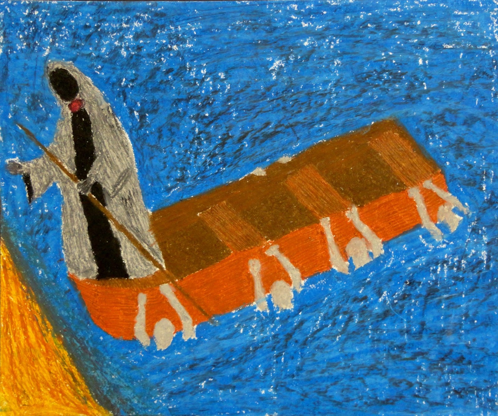
James A. Hagan, III - The Ferryman, oil pastel

James A. Hagan, III - Hagan Motors Experimental Logo Design, colored pencil

Mac Anderson - Melting Rubik's Cube grid drawing, colored pencil

Natalie Carroll - Colorful Fish with patterns and textures, marker and pencil

Ryan Himes - Asase Ya, oil pastel

Ryan Himes - Baby Self-Portrait, pencil

Shy'Miracle Ball - Music Love, colored pencil

Steven Holman - Pair of Aces, colored pencil

Sara Hutto - Untitled Surrealism Project, colored pencil

Tori Beaudion - Baby T, pencil

Tori Beaudion - Baby T (facial detail), pencil
So there you have it, a small cross-section of my students' art. In case the fact that I devoted an entire post to them didn't clue you in, I'm VERY proud of those kids.  They started out as my students, and by the end of the semester, I had a couple of hundred new family members. I hope you've enjoyed looking at these as much as I enjoyed watching them being created.  On a related note: if you know a child (or adult) who is interested in any art form (be it visual arts, performance arts, literary arts, etc.,) be sure to encourage them soon and encourage them often. You could easily be nurturing the imagination of someone who will one day change the world.

Make the world a better place through creativity and as always...
Stay creative,
AH!


Friday, June 7, 2013

GREAT NEWS, EVERYONE!

   Wow, it has been WAY too long since I've posted anything here. Great news, though! I've created a fair bit since last September and now have some of my newer drawings ready to scan and display. Expect some new posts soon(ish).
   PLUS, I'm putting together a post (or two) that features some art my students did this school year. I'm pretty proud of those kids and the progress they've made artistically.
   I also got some suggestions via anonymous comment for future projects, so keep checking in and see what my students have done, what I've done, and what I've yet to do.

Keep it artsy,
-AH!

Saturday, September 22, 2012

Desperately Seeking Inspiration!

As you may have noticed, I've missed a lot of posts lately. Here's the thing: I thrive on being forced to stretch my artistic muscles. I've come up with plenty of my own ideas to illustrate, but those are things that aren't really that challenging. Sooooo... I need your help! Surely someone (preferably multiple someones) in the nearly 25 countries that have viewed my blog can give me some kind of idea to get my creativity flowing. So please, please, pleeeease let me borrow just a little of your collective imagination and send me some ideas via email, comment, smoke signal, carrier pigeon, or psychic message.
On a side note, I'm still waiting for ANY submissions in response to this challenge. Just throwing that out there. Again.
Thanks in advance for your imaginational (yeah, I know that isn't a real word) generosity!
Stay creative,
AH!

Monday, September 10, 2012

I've Got the Blues...and Yellows...and Some Green...and a Touch of Red

Happy Sunday! It is Sunday, right? In any case, here's the "Sunday" post for the week.
Since I've already shown both abstract and objective art from my repertoire, I'll skip the explanations about what each is and refer you here and here for examples of objective pieces and here for abstractions.
This first painting is of a tropical fish, the species of which I don't recall (I have more of an affinity for mammals and reptiles than fish).  While the fish is obviously the focus of the painting, I decided to counterbalance the natural intense colors of the fish by removing all of the obvious color from the background.  I say the obvious color because in spite of appearance, the rocks, coral, and sand all contain a degree of blues and purples.  The viewers eyes perceive the small amounts of color on a subconscious level and add to the overall cohesion of the painting.
Next is a nude woman. Seriously. She's been abstracted to the point of being nearly non-objective, but does remain some identifiable features. This is in fact part of a pair of paintings, one abstract and one realistic. I may post the original at some point if I can get a good picture of it. Fear not though, in spite of being a nude the woman in the photograph I worked from is completely decent, so I can still maintain the family friendly atmosphere of the blog. But I digress, so back to the abstract version. With this one I chose to use a primary color scheme (red, yellow, and blue) for the figure of the woman. Since the background of the photograph was jungle foliage, I used green. The green also helps set off the figure from the background in the same way the grey background above helped set off the fish. 
 So there's the *ahem* "Sunday" post for this week. I'm afraid to say I've been slacking a bit in my art creation as of late, but I will definitely be remedying that in the coming weeks.  Speaking of weeks, I hope you all have a great one! Until next post...
Stay creative,
AH!

Sunday, September 2, 2012

Abstract Thinking

So I decided this week that I would introduce you to some of my abstract work. These paintings are of two very different types: figurative abstraction and total abstraction.
First is a total abstraction. Believe it or not, this is a painting of a road through the middle of a mountain forest in the fall.  In fact, it's an alternate view of this painting that I posted a couple of weeks ago.  In total abstraction, the subject of the painting is reduced to very basic colors and forms. Here the green and orange shapes could indicate leaves in the midst of transitioning into their fall colors to some, but may evoke completely different thoughts or emotions in others.  Total abstraction in many (even most) cases is less about what the artist sees, and more about what the art viewer sees. Both figurative and total abstraction also tend to convey the feelings of the artist about the subject.  In the case of this painting the artist (me) finds the fall forest both invigorating and peaceful. Paradoxical as those feelings may seem, I think I managed to get a little of both tucked in there.
 This second painting is of another facet of abstraction known as figurative abstraction. In this form the object being depicted is often simplified, but maintains a degree of what makes it recognizable.  This particular painting is of a pair of peace lilies. Notice that even though the shapes of the flowers and leaves are not any shapes that you're likely to see in nature, but are still distinguishable as flowers and leaves. As with the above painting, this painting expresses my feelings of the subject.  The flowing lines and smooth (mostly) cool colors are intended to evoke a feeling of calm and comfortable cool of the spring. The bright warm orange color at the center serves the duel purpose as a defined focal point and as a counterbalance to the cool colors throughout the rest of the painting.
Well, there you go. Two forms of abstract art all laid out for your consideration and (hopefully) enjoyment.  I'm percolating several drawing ideas that I plan to make time to put on paper in the weeks to come. Until then there are still paintings to come so keep checking in and suggest the same to your art-appreciating friends. Also remember, if you have any ideas for drawings, paintings, or even challenges for me please share them either in the comments section or email them directly to me at heymisterh@yahoo.com. Oh yeah! You can also now follow me by my twitter username @HeyMisterH.  I'll be posting links to all of my updates there now, too.
Stay creative,
AH!

Thursday, August 30, 2012

Mid-Week #11: An Odd Assemblage

So this week I had several thoughts on what to show for the mid-week post.  I finally decided to not decide and include a little of all of it. There's a bit of wire, a boredom sketch, and a work-in-progress.
First up: the wire-work. So there's a very short back story for this one. Like most great stories, it starts with a trip to the grocery store.  After doing the shopping I was waiting in line for the self-checkout.  While waiting in the aforementioned line I spotted something shiny on the floor.  If I see something shiny, I investigate. In this way I am much like a toddler...or maybe a raccoon. Either way, I picked up the object and found it to be a silver plastic-coated twist-tie. I removed the plastic and began to work the wire into shape. Since the wire was only a couple of inches long, this process was quite short. What emerged was the first ever MicroZeke! In case you have no idea what that is, it's a tiny version of this guy. So when I got home I took some pictures with a penny for size reference. Here they are.

Here's the boredom sketch.  As you can see it's a balloon with jagged sharp teeth and a survival knife.  I thought "How could a balloon be in any way threatening?" Question answered.  I also gave it the gift of speech to imply some degree of intelligence. If it has the ability to think it could potentially have malevolent intent. Yeah...that's about it...
 As an artist I am begrudged to show any unfinished work, but I thought posting this one might encourage me to go ahead and finish it. It's a large humanoid bat creature that popped into my head (or should I say popped out of my head) while I was on a break at work one day.  I will definitely post the final product at some point in the (hopefully near) future. Who knows? Maybe this will start off a new series of Works-in-Progress Wednesdays to give you an idea of the process that goes into making a finished drawing.
There's another week inside my mind.  It may be a place of chaos, but it's my chaos.  More paintings are coming Sunday, so check back then.  Also, my thoughts and prayers also go out to those affected by Hurricane Isaac as it moves across the Gulf Coast. Stay safe everybody, no matter where you are and of course...
Stay creative,
AH!


Monday, August 27, 2012

The Menagerie Amasses

It's the beginning of the week again (sort of), so in case yours is off to a bad start (or not) here are a couple of animal paintings to brighten your day.
First up is a monkey.  Usually I'd be more specific with the monkey's species name, but for the life of me I can't remember what this one is.  I worked from a photograph on this, so I know it is an actual species... Anyway, I painted it because I like monkeys.  Add to that the fact that for some reason this particularly bizarre little monkey was chewing on a piece of volcanic glass, and it was practically screaming (to me at least) to be painted. Some day I'll find just the right place in my house to hang this one. Since he's apparently hungry enough to eat volcanic glass, maybe over the kitchen table would be appropriate. Definitely not the bathroom, though. I don't think anyone would want to have a wide-eyed monkey staring at them as they step out of the shower. Well, maybe some people...weirdos...
This next little guy is a scarlet ibis.  I tried a different painting technique than I usually use on this.  As opposed to most paintings where I start with a solid white canvas, on this one I painted the whole canvas black first (for other examples of this method, run an Google image search for "velvet Elvis").  The desired effect (which was achieved) was to give the ibis a stronger sense of chiaroscuro, or light and dark and, in doing so, gives the subject a stronger sense of three-dimensionality. A similar effect could have been achieved by using the "standard " method and painting tones and shades of the bird's natural bright scarlet by adding white, black, or even small amounts of green paint to it while mixing. That method, however, can easily make vibrant red into muddy pinks and dull reds if not done correctly.
There you have it, Sund...er...Monday's post. Hopefully I'll be able to get back onto some kind of normal posting schedule this week.  Don't forget: Comments are always greatly appreciated. Let me know what you think about my art and/or blog.
Stay creative,
AH!

Thursday, August 23, 2012

Mid-Week #10: An Epic Battle... of Decoupage!

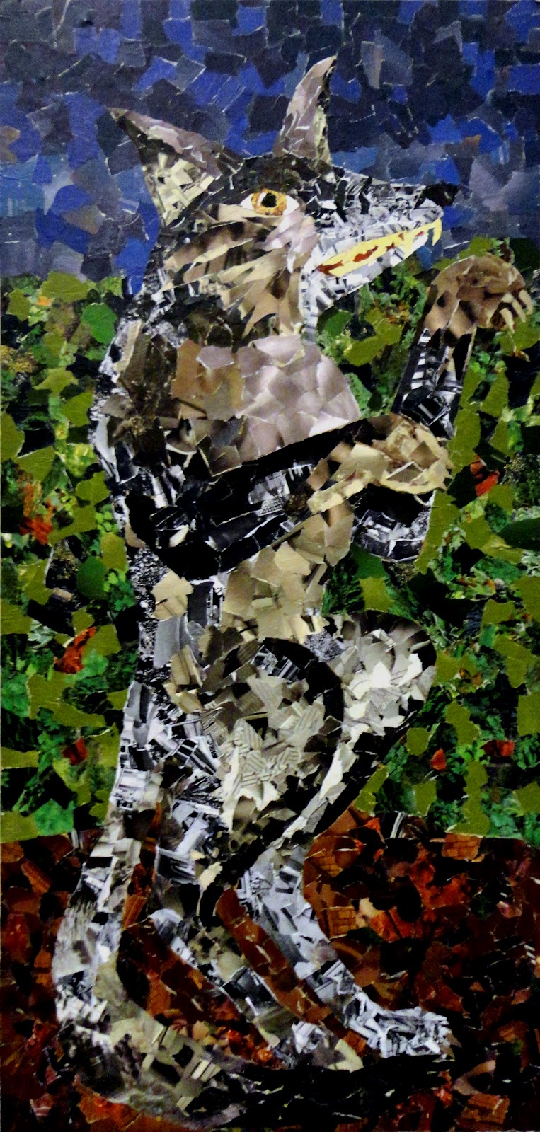
So for this mid-week post I decided to share some of my art of a different medium.  These are a pair of decoupage pictures. They aren't traditional decoupage, since I didn't use any complete pictures instead opting to use the pictures of textures and colors to form new pictures.  These started as an assignment for a mixed-media class in college. I had never done any decoupage before this, but took to it like a duck takes to water...or like a fish takes to swimming...or like a bull takes to trampling through the streets of Pamplona, Spain...anyway, you get the idea. I began with the wolf while in class, and enjoyed that so much that I came home and started the lion.  I threw in individual images and detail close-ups of the faces to give a better idea of what sort of texture images form the animals and background.


Well, as you probably noticed, I also made a few cosmetic changes to the blog this week. The biggest of these being the addition of a new header.  As time goes by, I'm going to try to update the logo using the styles of some of the artists that inspire me. After going through many different variations, I settled (with a little help from a couple of friends) on the design below.  The design is a tribute to the late, great Jack Kirby who co-created such characters as Captain America, the Fantastic Four, the Hulk, and the X-Men, among others. His artistic style is among my all-time favorites. The background of the caption bubble is my attempt at replicating one of his most famous techniques known as the Kirby krackle (one of the few times I'm okay with a word being intentionally misspelled).
I can only hope that my art will some day be even one-millionth of the inspiration to others that Mr. Kirby's art is to me and artists worldwide. Until Sunday...
Stay creative,
AH!

Sunday, August 19, 2012

Woohoo! Fall's Just Around the Corner!

So, after a crazy week, I've come to the painful realization that I simply won't be able to post every Sunday and Wednesday. That being said, I vow to make every effort to miss as few of those days as possible.  I have grown to enjoy this whole blogging process quite a lot since I started and miss it when I don't get a chance to post. Anyway, without further ado, here is the Sunday post.

Since I'm posting paintings for a few weeks, I thought some simple landscapes would be a good starting point. Most of the paintings I'll post in the coming weeks were painted during my time in college, but hopefully as time progresses, I'll produce even more to share with you.
These are both landscapes painted from photographs of Arkansas.  From very early childhood my family has taken camping vacations in various places throughout the southern United States.  Arkansas, specifically the Albert Pike Recreational Area in the Ouachita National Forest, has always been a family favorite spot. The period at the beginning of fall, when the leaves are just starting to turn is a nature-loving artist's dream come true.  Between these two paintings, I'm a bit partial to the first one. It features one of the more shallow spots in the Little Missouri River. Artistically, I like the way that the background trees going up the side of the mountain turned out. It was my first attempt at aerial or atmospheric perspective, where the contrast between the landscape features decreases as the distance from the observer increases. That's all just a kind of fancy way of saying that the stuff that's far away is less clear than the stuff that's close up. I opted for less detail and more of an abstract take for this one, almost going to the point of being impressionistic.
 This next one is of one of the many winding mountain roads that lead to and through the Ouachita National Forest.  I went even more abstract with this one, which gives it less depth. I also used more strong fall colors that really illicit great childhood memories for me. While the painting above gives a morning or early in the day feeling, this one has more of an afternoon or early evening feel. Were I to paint it again I would probably include a bit more tree shadow on the road, but given the more abstract overall feel of it, I guess they aren't that missed.
Well, there you go. There will of course be more paintings next week, so stay tuned for that. Wednesday, I'll try to get my regular post up, but barring any unforeseen obstacles I will be debuting the new blog page header. I hope you're enjoying the painting posts so far. Since I haven't mentioned it in a while, feel free to post any comments or suggestions in the section below, or send them to me by email. Hope you all have a terrific week! See you (figuratively speaking...er...typing) Wednesday.
Stay creative,
AH!

Wednesday, August 15, 2012

My Apologies for the Slight Delay

Due to a pretty crazy day today, and likely much of the same tomorrow, the usual Wednesday post will probably go up either late tomorrow or sometime Friday evening... or maybe Saturday... or maybe I'll count this mid-week post a loss. Hmmm... Whichever it ends up being, thanks in advance for your patience.
-AH!

Sunday, August 12, 2012

Here Come the Paintings!

Wow! Those posts last week were the best EVER, right?!...
Wait...don't tell me the space aliens got to them again! Greedy aliens. It's so frustrating when they do that. I guess I'll post them again this week so you all can see them too.
So here are a few paintings I was commissioned to do by a friend at church. They aren't really indicative of my normal style, but they are the only three that I've had a chance to get good pictures of. She basically gave me only 3 criteria to fulfill. First, she wanted a specific color set to go with her furniture and other decor. Second, she had a series of words to be included (specifically the nine aspects of the fruit of the Spirit as described in Paul's Letter to the Galatians chapter 5 verses 22-23 in the Christian Bible). And finally, I was to include my own interpretations of nine eastern Asian inspired images that she had chosen. I don't by any means profess to be an expert when it comes to the creation of objective abstract art. That being established, I finally finished the triptych and she liked it, so I suppose I accomplished my mission. Here they are, both individually and in what I consider to be their optimal wall arrangement.
As a side note, I feel like it's worth pointing out that regardless of your personal beliefs, if we all took on even some of these nine traits it would be beneficial to mankind as a whole. Our world has quite enough negativity, but could easily stand to be a little more patient, gentle, kind, loving, etc,.
There you have them, hopefully safe from extraterrestrial interference this time.  As usual (well usually, as usual) check back Wednesday to see what's else I've got in store for your viewing enjoyment.  Until then, let's all make this oft-too-crazy world we live in a happier place any way we can. And of course...
Stay creative,
AH!